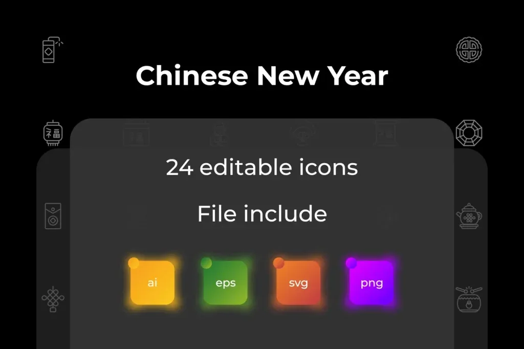
Vector icons for clear and consistent visual communication
Vector icons turn concepts, actions and categories into compact visual symbols that can work across websites, apps, infographics, presentations, packaging and social graphics. A useful icon set is not simply a collection of attractive drawings. The symbols need to share a consistent visual language so viewers can understand them quickly and so the design feels like one system rather than a mix of unrelated assets.
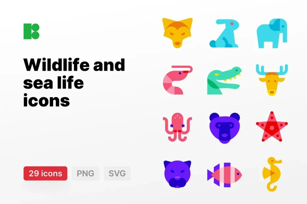
This category includes themed icon collections such as aviation, technology, sustainability, fruit, wedding and seasonal subjects. Start by choosing the subject coverage you need, then compare style, stroke weight, corner treatment, level of detail and how well the set behaves at the size where it will actually be used.
Choose one icon style for the whole interface or layout
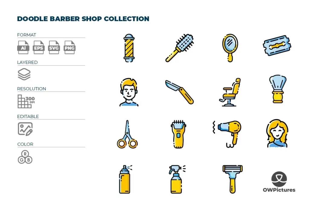
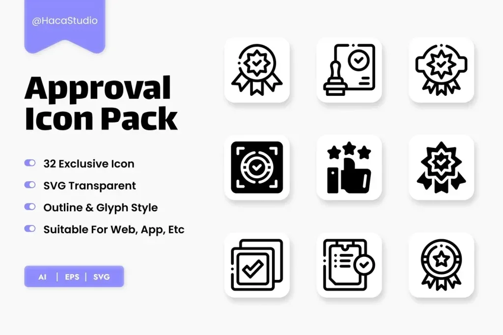
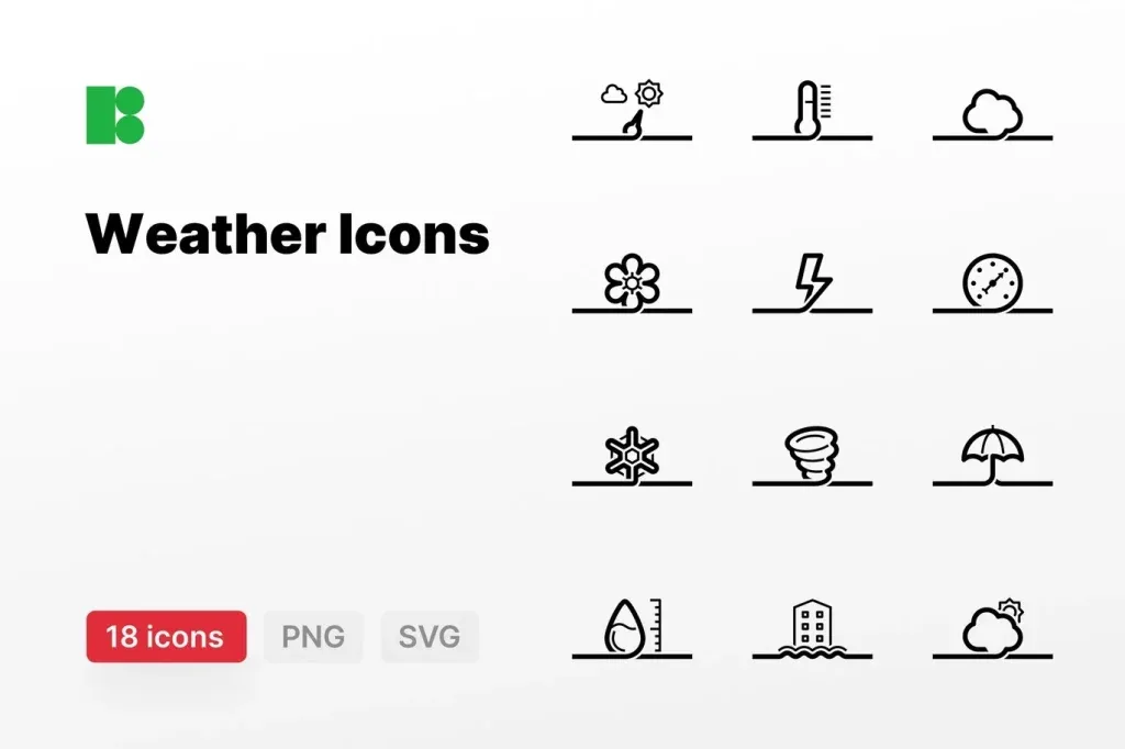
Outline, filled, flat, duotone and more dimensional icons create different visual impressions. Mixing them without a reason can make a design look inconsistent. If the main set uses thin rounded outlines, adding a heavy filled symbol can attract attention for the wrong reason.
Compare several icons from the same pack, not just the strongest preview example. Check whether circles, arrows, people, objects and small details follow similar proportions. Consistency across difficult symbols is a better quality signal than one impressive icon.
Inspect stroke weight, corners and internal spacing
Outline icons depend heavily on stroke consistency. At small sizes, very thin lines can disappear and tight internal spaces can close up. Filled icons have a different problem: shapes may merge if negative space is too narrow. Test the actual icons at the target pixel size instead of judging them only at large zoom.
Rounded and sharp corners also affect personality. A soft consumer brand may fit rounded symbols, while technical or industrial work may use more geometric forms. The icon style should support the tone of the project rather than being chosen independently.
Use vector flexibility without ignoring final-size testing
Vector artwork can be resized without the same pixelation behavior as raster images, but unlimited scaling does not guarantee good visual performance. Details that work at 128 pixels may be unnecessary at 20 pixels. Some symbols need simplified versions for navigation, buttons or compact labels.
Adobe Illustrator provides vector editing and export workflows for multiple outputs. Review the individual product file to confirm the supplied formats and structure, then export the version appropriate for the final platform instead of assuming every asset includes the same deliverables.
Recolor icon sets as a system
When editing is available, define color roles first: default, active, disabled, warning or category-specific. Avoid recoloring every icon independently unless categories genuinely need different meanings. A limited palette improves recognition and makes interface states easier to learn.
Check contrast on both light and dark backgrounds. Thin icons in low-contrast colors can become hard to see, while highly saturated symbols may dominate text and other interface elements.
Keep icon meaning familiar when usability matters
Icons can reduce text, but unfamiliar symbols can also create ambiguity. For common actions such as search, home, settings or download, recognizable conventions are usually more useful than highly decorative alternatives. When a symbol may be unclear, pairing it with a label can improve understanding.
For infographics and presentation graphics, icons can support data categories or section headings. Use them to reinforce information rather than replacing essential explanation with symbols that require guessing.
Align icons precisely inside a shared grid
Two icons can have identical canvas dimensions and still look different in size because their visual mass is different. Compare optical size, baseline and center, especially when symbols appear in a row. Small positional adjustments can make the set look much more balanced.
When exporting individual icons, keep a consistent artboard or view box strategy. This reduces alignment problems later in interface design or layout software.
Final checks before using an icon set
Review the individual product page for actual formats and supported software. Test several icons at the smallest intended size, compare stroke and spacing, verify color contrast and make sure no important symbols are missing from the subject set. If the project uses many icons, create a small reference sheet showing size, color and usage rules.
A strong vector icon set should communicate quickly, remain recognizable at practical sizes and feel consistent across many symbols. The best choice is the set that fits the project’s visual language and information needs, not simply the pack with the largest number of icons.