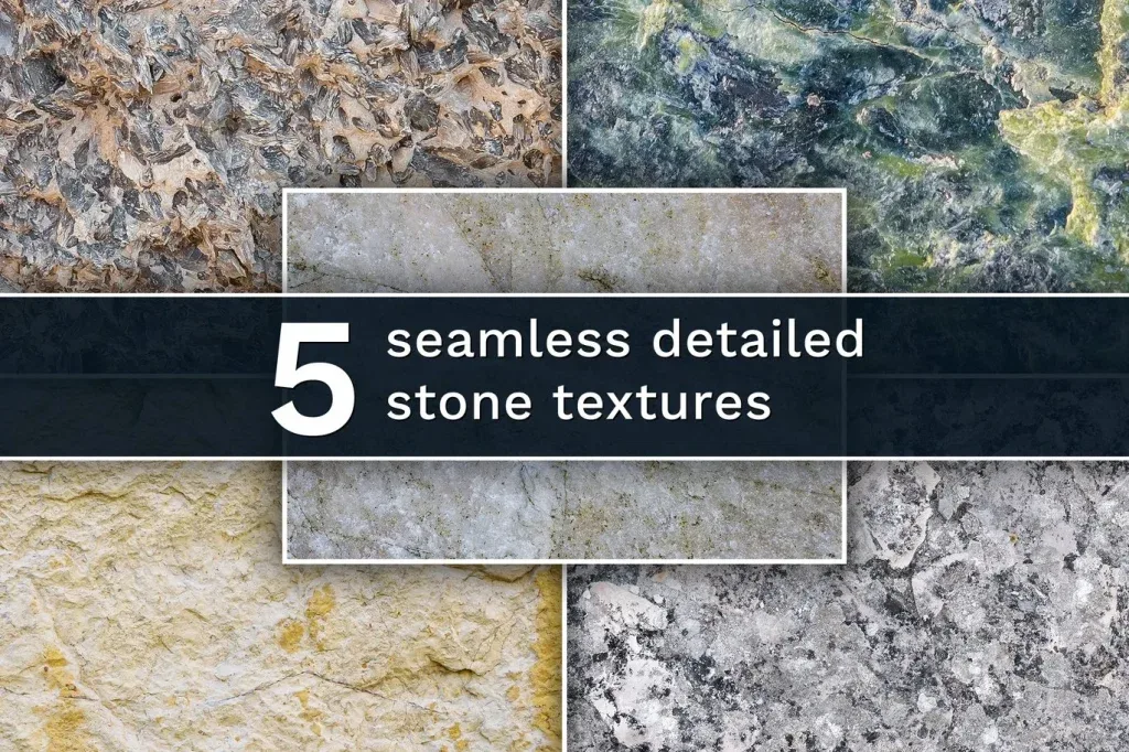
Graphic textures for adding believable surface detail
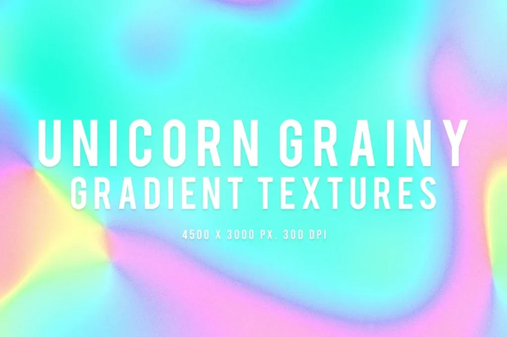
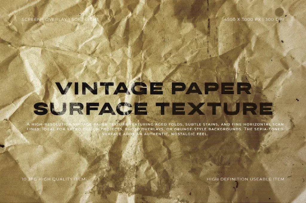
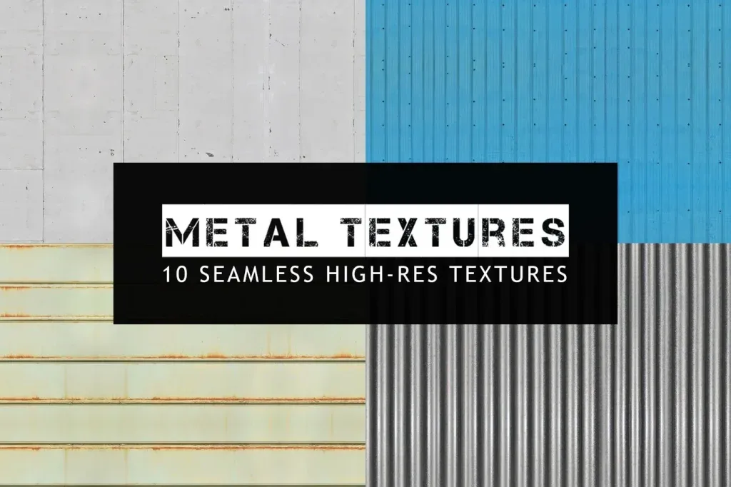
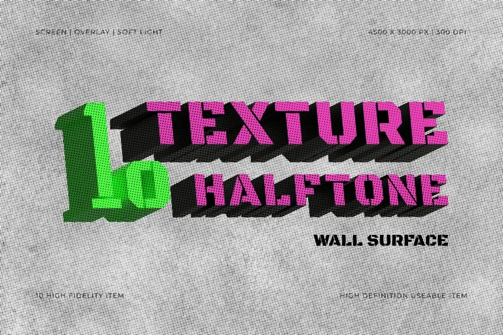
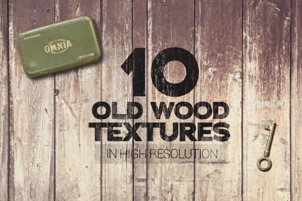
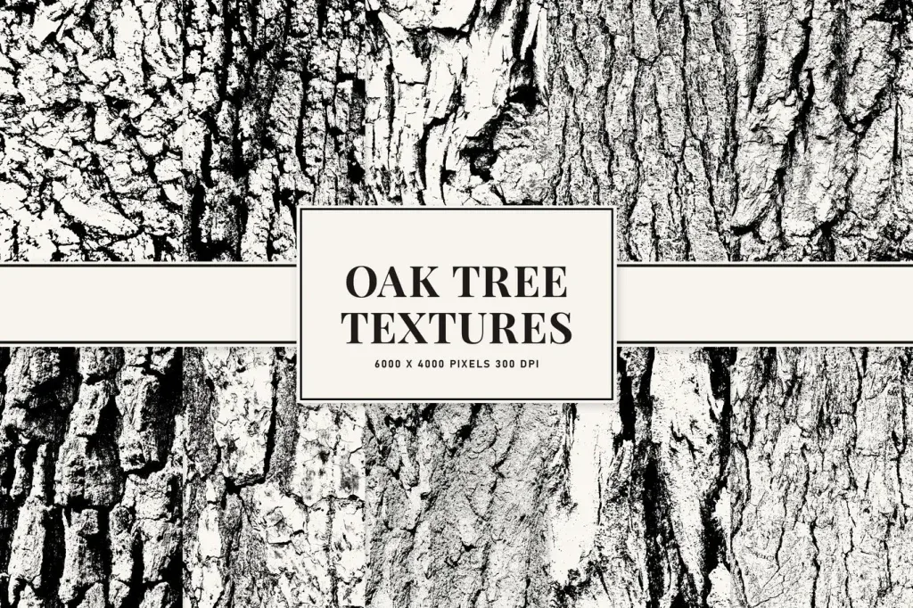
Graphic textures add visual information about a surface: roughness, grain, wear, stone, wood, paper, concrete, metal or other material qualities. They can be used as backgrounds, overlays, masks or supporting layers that make flat color feel more tactile. The most effective texture is not necessarily the most detailed one; it is the one whose scale and contrast match the design.
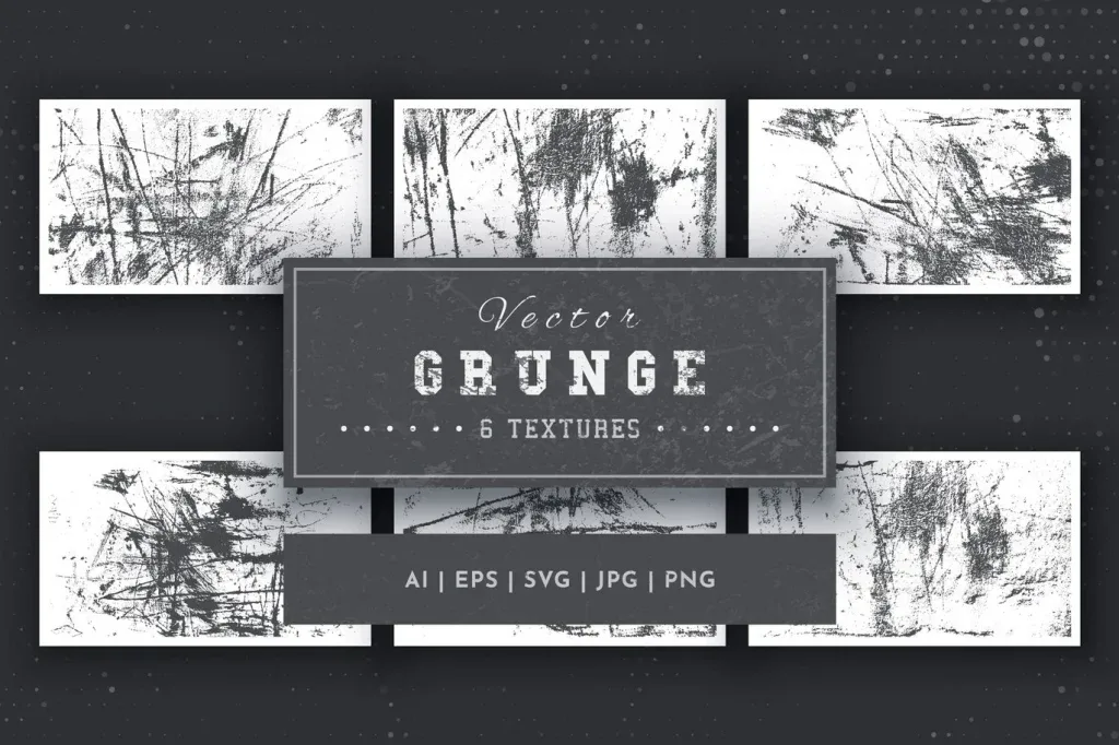
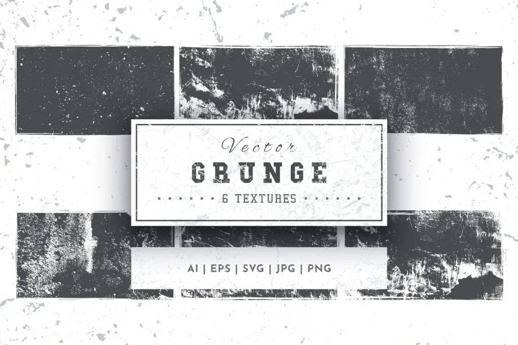
This category includes surface-driven resources such as wood, brick, stone, grunge and dark texture sets. Before choosing a file, decide whether the texture should be noticed as a material or remain subtle enough to support typography and other content.
Match texture scale to the size of the design
Texture scale changes perception. Large cracks or wood grain may work on a poster or packaging panel but feel oversized on a small card or interface. Fine grain can add depth to a digital background yet disappear in a large print viewed from a distance.
Test the texture at final output size. Do not judge it only while zoomed in. If the pattern of the material becomes distracting or repetitive, adjust scale, crop or intensity.
Use contrast without sacrificing readability
A high-contrast brick or grunge surface can compete with text. If the texture sits behind a headline, reduce contrast, blur selected detail or use a color layer to create a quieter reading area. When the texture is the main visual subject, supporting typography can be simpler.
Check both light and dark text options rather than assuming one will work across the entire image. Uneven surfaces can create local areas where contrast changes significantly.
Layer textures with purpose
Textures can be combined through opacity, blending modes, masks and tonal adjustments, but every added layer should have a role. One surface may establish material, another may add subtle grain and a third may create edge wear. Too many unrelated textures can make the design feel dirty rather than intentional.
Keep a clean version of the base composition so you can compare before and after. If removing a texture improves clarity without losing the intended mood, the layer may not be necessary.
Consider material direction and perspective
Wood grain, brushed surfaces and directional scratches have an orientation. Rotating or stretching them without attention can make a surface feel unrealistic. When a texture is mapped onto an angled object, perspective and scale should support the direction of that object.
For flat graphic use, realism may be less important, but directional consistency still affects the visual flow. Grain can lead the eye toward a focal point or unintentionally pull attention away from it.
Prepare textures for color systems and brand work
A texture can be recolored or desaturated when the file structure allows, but preserve enough tonal variation for the surface to remain visible. Brand colors should not eliminate all material information. At the same time, avoid letting texture color shift the overall palette away from the intended identity.
For a campaign with several layouts, use the same texture treatment consistently. Matching intensity and scale across deliverables can create a recognizable visual system.
Check technical quality before final output
Review the individual product page for actual file formats and supported software. At full size, inspect edges, compression, repeated areas and unwanted artifacts. If a texture needs to cover a large area, make sure the source has enough detail for the intended output.
Graphic textures work best when they create material and atmosphere without hiding the message. Use them as controlled design information, not as an automatic effect applied to every surface.