Graphic design assets are most useful when you start with the job they need to do
Graphic design assets can shorten production time, but only when the file type matches the role it needs to play in the composition. A background creates the visual field behind the message. A texture adds surface and material character. A pattern is built for repeated coverage. An icon communicates a concept at small scale. A graphic object can be combined with type and photography, while an illustration may carry a larger part of the story. Treating all of these as interchangeable “graphics” makes browsing harder and usually creates more editing work later.
This parent category is designed as a route into those different asset types. Before choosing a file, define the final output: poster, social post, packaging, interface, presentation, web layout, print piece or campaign artwork. Then decide what role the asset will perform. That simple sequence—output first, asset role second—makes it much easier to choose something that can actually be reused and customized instead of downloading a visually attractive file that does not fit the project.
Use backgrounds to create space, contrast and visual direction
A background should support the main message rather than compete with it. In text-heavy layouts, negative space and controlled contrast often matter more than detail. In a cover or poster, the background can become a stronger visual feature. Gradient, abstract, technology, thematic and image-based backgrounds all solve different composition problems, so the preview should be judged with the future text, logo or product in mind.
Browse the dedicated Graphic Backgrounds category when the main need is the visual field behind a design. Test the file with real copy before committing. A dramatic image can work beautifully as artwork while making a long headline almost impossible to read.
Textures add material character without needing to become the subject
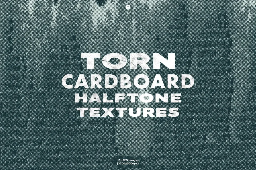
Textures can introduce paper grain, concrete, metal, halftone, noise, fabric or other surface qualities. They are often most effective at restrained opacity, where they prevent a layout from feeling flat without overwhelming the content. The scale of the texture matters: fine grain can disappear on small screens, while oversized texture can dominate a large print.
The Graphic Textures category is the more focused place to compare those files. Check pixel dimensions and intended use on the individual product page. A texture that looks rich at 100 percent zoom may behave very differently when reduced to a mobile card or enlarged across a poster.
Patterns should repeat cleanly and remain balanced at different scales
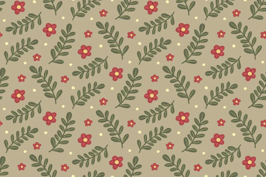
Patterns are useful for packaging, stationery, textiles, gift wrap, web surfaces and branded systems where repetition is part of the design. The most important practical question is how the unit repeats. If the tile edge becomes obvious, the problem will be multiplied across a larger surface. Scale also changes the character of a pattern: a dense motif suitable for a small label may become visually noisy across a large package.
Use the Patterns category when repetition is the core requirement. Test more than one scale and color treatment before finalizing. If a pattern is intended to sit behind text, make sure the repetition does not create high-contrast areas directly behind important copy.
Icons need to remain recognizable at the size where they will actually be used
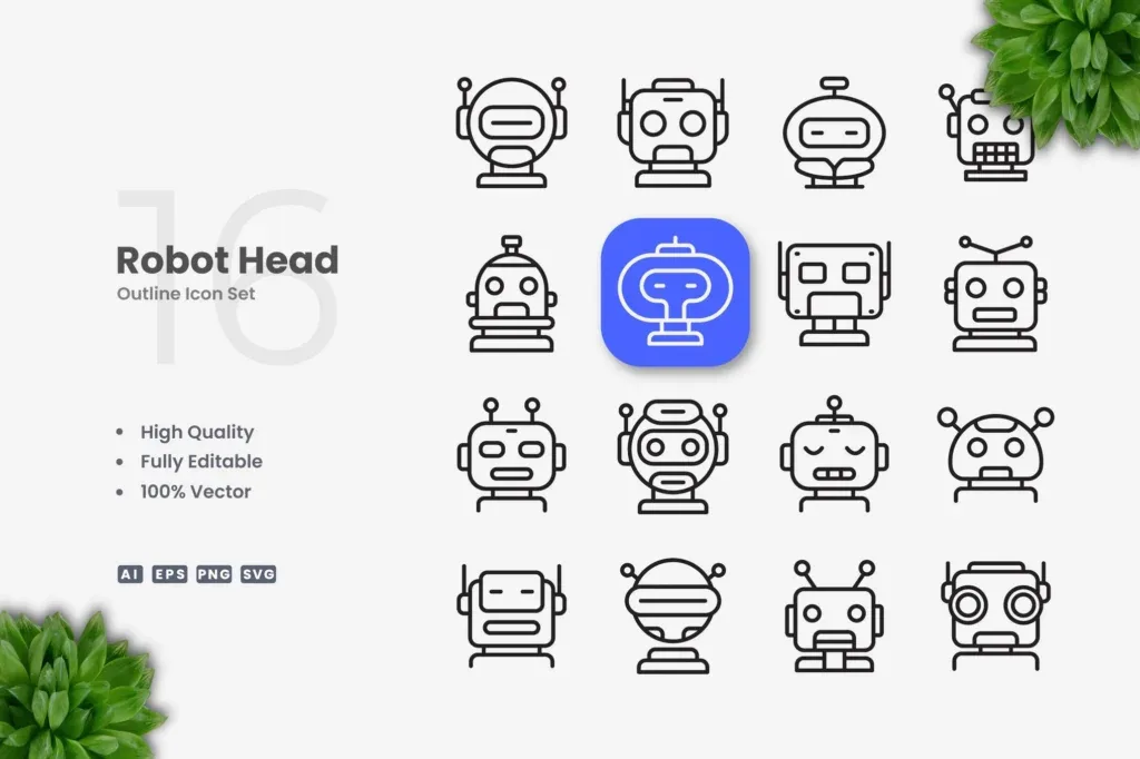
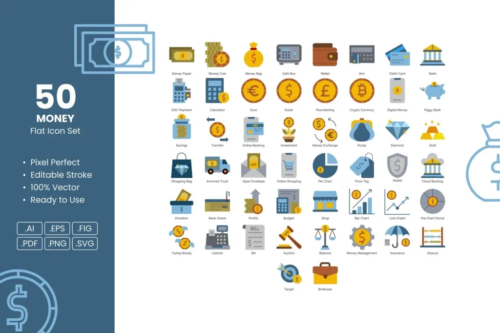
Icons are not miniature illustrations. Their job is usually to communicate quickly, often at interface or navigation size. Line weight, corner style, filled versus outline treatment and negative space should remain consistent across a set. A symbol that only works when enlarged may not be a good interface icon even if the artwork itself is attractive.
Browse Graphic Icons as a system rather than picking isolated symbols from unrelated styles. Place representative icons at their actual target size and compare them side by side. Consistency across ten icons is usually more valuable than having one highly detailed icon that does not match the rest.
Graphic objects are flexible components for building a larger composition
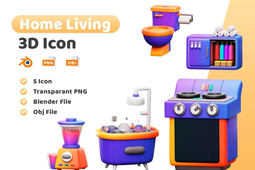
Objects can include badges, decorative shapes, isolated elements, stickers, 3D pieces or themed assets intended to be combined with text, photography and other graphics. They usually function as parts of a composition rather than as the finished design. Their usefulness depends on clean edges, suitable scale, transparency where relevant and a style that can be integrated into the project.
The Graphic Objects category is useful when you need modular elements for posters, campaigns or social layouts. Compare perspective, lighting and shadow style before combining assets. A photorealistic object placed next to flat vector graphics can feel inconsistent unless the whole composition is adjusted deliberately.
Illustrations carry more narrative weight than icons or decorative objects
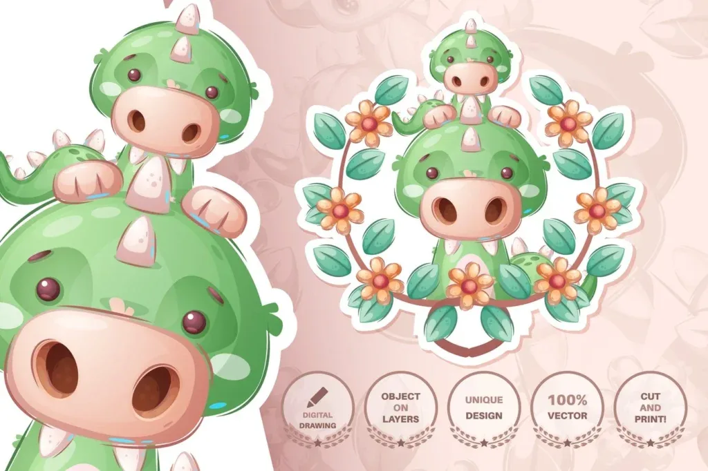
An illustration can become the main visual in a landing page, article, campaign, poster or presentation. Because it carries more character, style matching matters. Perspective, stroke treatment, shadow language, character proportions and palette all contribute to the visual identity. Recoloring two unrelated illustrations does not automatically make them feel like one set.
Use Illustrations when the image itself is expected to communicate a scene, subject or idea. If several illustrations will appear together, choose them as a family and test a representative group before building the complete design system.
Choose file format according to how much editing the project requires
Graphic assets can be vector, raster, layered or delivered for direct use, and those structures support different workflows. A vector file can be valuable when colors, shapes and size need frequent changes. A high-resolution raster image can be entirely appropriate for a texture or finished background. A layered document may help when elements need to be rearranged. There is no single format that is best for every category.
Read each product page for the actual format and supported software rather than assuming the whole category follows one rule. More file types do not automatically mean better value. The useful format is the one that lets you perform the edits the job actually requires without unnecessary conversion or reconstruction.
Understand the practical difference between vector and raster assets
Vector graphics are mathematically described and can generally scale without the same pixelation limits as raster images, which makes them especially useful for icons, patterns and many reusable graphic elements. Raster files depend on pixel dimensions and are common for textures, photographic backgrounds and complex image effects. Large-format output requires enough source resolution to preserve detail.
Do not oversize files without reason either. Extremely large images can make working documents heavier and slower. Match the source to the target output, and keep the original asset available in case a larger version is needed later.
Print work needs more than a good-looking screen preview
A graphic that looks clean on a monitor may need additional checks for print. Final size, bleed, fine detail, image resolution and the printing process can all affect the result. Very subtle texture or low contrast may reproduce differently on paper, and tiny lines may not hold as expected at the final physical size.
When a design is important, create a proof or small test before a large print run. The downloaded asset is only the starting material; final print preparation remains part of the designer’s responsibility. Keep text, logos and essential information inside safe areas and follow the requirements of the printer producing the job.
Social design should be planned around multiple aspect ratios
Square posts, vertical stories, portrait feeds and horizontal covers leave different amounts of room around the focal point. A background that works in 1:1 may crop poorly in 9:16. An object positioned near the edge can disappear when the same design is adapted for another platform. Test likely crops before investing heavily in customization.
Modular assets often make multi-format campaigns easier. A background with usable negative space plus separate graphic objects can be rearranged for several compositions more easily than one flattened image whose focal point is locked into a single frame.
Combine assets from different sources into one visual language
Real projects often mix a background from one set, icons from another and an illustration from a third. Without adjustment, differences in line weight, shadow, corner radius, color and perspective can reveal that those pieces were not designed together. A short style test before full production can identify that problem early.
Define a small system—palette, line weight, shadow depth, corner treatment and texture level—and bring the chosen assets toward those rules. The goal is to make reusable resources feel specific to the project rather than to preserve every default choice from the original previews.
Preview colors are examples, not a required design decision
If the file is editable, use the real project palette. Not every element needs the primary brand color; neutral tones and a controlled accent often create better hierarchy. Backgrounds and textures are especially sensitive to contrast because they sit behind other information. Icons and objects need to coordinate with the rest of the interface or composition.
Evaluate color at the page level rather than optimizing every asset separately. A file that looks vivid in isolation can become distracting when combined with photography, typography and additional graphics. The final system matters more than the original thumbnail.
Workflow speed is part of the value of a ready-made asset
A resource is supposed to save time. If using it requires rebuilding confusing layers, locating missing components or correcting a structure that does not fit the job, a simpler asset may be the better choice. Estimate the work remaining after download rather than judging value by the number of included files.
Reusable assets become more valuable over multiple projects. A coherent icon set, editable pattern or flexible background can become part of a personal or team library. Files that can be adapted quickly often save more production time than visually complex resources that only work for one specific composition.
Check licensing and product-specific usage terms
Being downloadable does not mean a file can be redistributed, resold as a source asset or used in every commercial context. Licensing can vary by product and source. Check the relevant terms when a graphic is used for client work, packaging, merchandise or products intended for resale.
Keep a record of important licenses in commercial workflows. This is especially useful when a design may be updated months later by another team member who needs to know where the source came from and what use was permitted.
Organize graphic resources before the library becomes difficult to search
As a collection grows, finding the right asset can take longer than creating the design. Separate folders or catalog tags for backgrounds, textures, patterns, icons, objects and illustrations. Use searchable names instead of relying on generic download filenames. Preview sheets can be helpful for large sets.
Keep the untouched source separate from customized brand versions. That makes it possible to return to the original file for another campaign without losing previous work and prevents accidental overwriting of the reusable master.
Test every asset in the real composition before committing
A large thumbnail can make an asset look stronger than it will at final size. Put the background behind the real headline, view the icon at interface size, repeat the pattern across a surface and place the illustration beside the actual copy. Those quick tests reveal whether the file supports the design or simply has an attractive preview.
If the asset only becomes usable after extensive reconstruction, another option may be more efficient. Ready-made resources are most valuable when they reduce repeated work while leaving enough control to make the result specific to the project.
Use a simple checklist before downloading graphic design assets
Define the output and the role of the asset. Choose the correct child category. Check format and software compatibility on the product page. Review scale or resolution, test color and style against the real composition, and consider how the file will adapt to other sizes. When multiple assets are combined, evaluate them together rather than one at a time.
Graphic design assets are best treated as customizable building materials. Choosing the right background, texture, pattern, icon, object or illustration can shorten production substantially while keeping creative control with the designer. The strongest resource is not necessarily the one with the biggest bundle; it is the file that fits the job and remains easy to adapt.