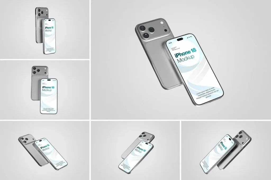
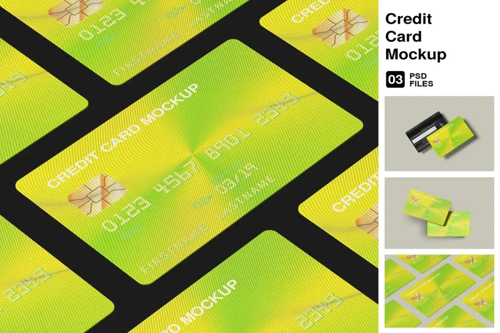
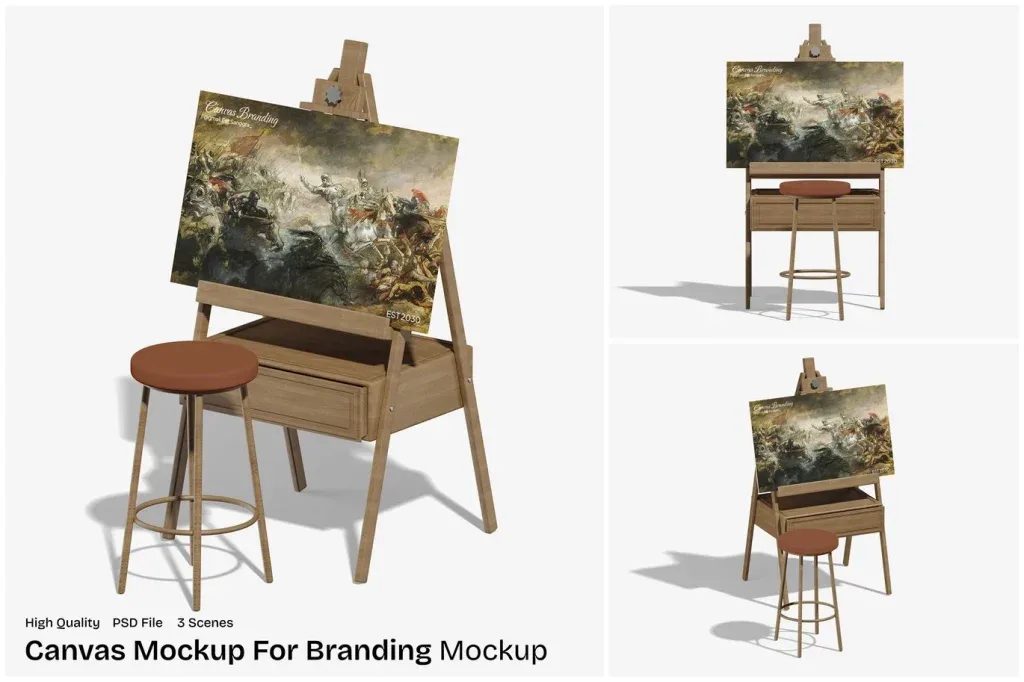
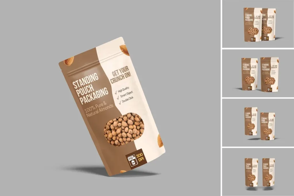
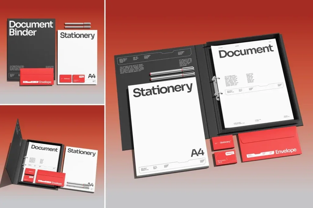
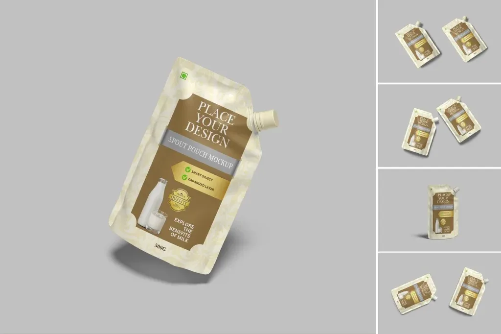
Branding Mockups PSD help designers present a visual identity in context instead of showing a logo or graphic as a flat file. The most useful mockup is the one that matches the real place where the identity will appear and gives the design enough visual priority. When comparing options, look at the type of surface, camera angle, lighting, background detail and how much room the composition leaves for the brand element.
Choose a scene that reflects the brand touchpoint
A mockup should support the story you want to present. A clean desk or stationery scene can suit a corporate identity, while signage, packaging or textured surfaces may communicate a different use case. Avoid choosing a scene only because it looks dramatic. The environment should make sense for the identity and should not introduce visual cues that conflict with the brand’s tone, colors or audience.
Check composition and lighting before editing
Strong perspective, shadows and highlights can make a presentation feel realistic, but they also affect how clearly the logo or artwork is seen. Review where the main design sits in the frame and whether the surrounding objects compete for attention. If you plan to use several mockups in one case study, select scenes with compatible lighting and visual weight so the final presentation feels like one system rather than unrelated images.
Review the editing workflow for each product
PSD mockups can use different layer structures. When a file provides Smart Objects or dedicated replacement layers, they can make artwork placement more efficient, but you should verify the product details rather than assume every item works the same way. Before choosing, consider how many surfaces need replacement, whether your artwork fits the shown perspective and how much adjustment may be required for color, contrast and crop. A practical mockup should improve presentation without creating unnecessary production work.