Illustration assets for visual storytelling and design
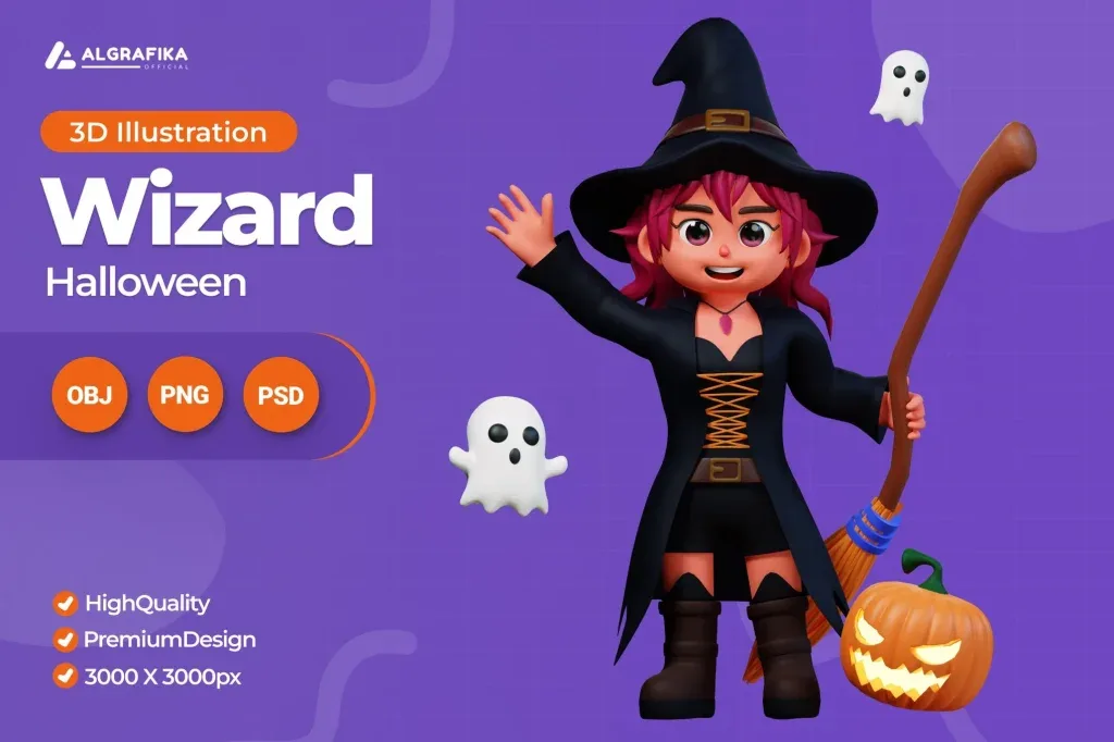
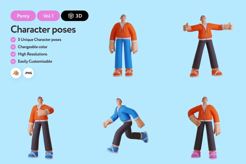
Illustration assets help communicate ideas that may be difficult to photograph or explain with text alone. They can depict people, products, abstract concepts, workflows, sports, technology, finance, research and many other subjects in a controlled visual style. This category includes a wide range of ready-made illustrations, including 3D characters and conceptual scenes, so the right choice depends on the message, audience and layout rather than a single preferred aesthetic.
Adobe distinguishes illustration artwork from vector assets because illustrations can include a broader range of textures, techniques and rasterized styles. That makes it important to review the actual product format and editability instead of assuming every illustration behaves like a vector file.
Choose an illustration style that fits the subject
A playful 3D character can work well in a consumer app or social campaign, while a cleaner flat or editorial style may be more appropriate for business, research or education. Sports imagery may need a sense of motion and energy; finance or payment concepts often benefit from clearer symbolic structure.
Compare several assets from the same visual family. Look at facial proportions, perspective, lighting, color treatment and detail level. If multiple illustrations will appear in one website or campaign, consistency between scenes is usually more important than finding the most dramatic image individually.
Match composition to the space available in the layout
Some illustrations are centered and self-contained, while others leave negative space for a headline, button or supporting text. Decide where the image will sit before choosing it. A detailed composition that fills every corner may be difficult to use in a landing page hero if the design also needs prominent copy.
For cards and small content blocks, a simple focal subject is easier to read. For posters or full-width sections, wider scenes can carry more narrative detail. Test the crop in the actual layout instead of relying only on the asset preview.
Check scale, edges and detail at final size
Fine details that look attractive at full resolution can disappear on mobile. Small accessories, thin lines and subtle facial features may merge when reduced. At the opposite extreme, low-resolution raster artwork may soften if enlarged for a large presentation or print piece.
Review the image at the target output size and inspect important edges. If the illustration needs to be placed over different backgrounds, check whether its boundaries, transparency or background treatment support that workflow.
Use color to integrate the asset into the brand
If the file is editable, adjust colors according to the project rather than keeping the preview palette by default. Identify primary, secondary and accent colors, then preserve enough contrast between the subject and background. Do not recolor every object independently; a limited system usually feels more intentional.
When the asset cannot be fully recolored, choose one whose existing palette already fits the project. Heavy global color correction can damage skin tones, material shading or the original balance of the illustration.
Understand the difference between decorative and explanatory illustration
A decorative illustration creates mood and visual interest, while an explanatory illustration helps a viewer understand a process, concept or relationship. The two should be selected differently. An editorial article may need a conceptual image; a product workflow may require a scene that clearly shows stages or roles.
Ask what the viewer should understand after seeing the image. If the illustration cannot answer that question and is not intentionally decorative, it may be unnecessary.
Build a consistent illustration system across a project
For a website or campaign with several pages, define a small style rule: perspective, character proportions, background treatment, shadow depth and palette. Use those rules when selecting additional assets. This reduces the risk of mixing flat, isometric, realistic and cartoon styles without a clear reason.
If the project uses both 3D and 2D imagery, separate their roles. For example, use 3D hero illustrations for major sections and simpler line graphics for supporting information instead of mixing every style in the same visual layer.
Final checks before using an illustration asset
Review the individual product page for actual formats, supported software and any editable structure. Check the crop, subject placement, color compatibility and image quality at the final size. Remove sample text or irrelevant details where the file allows and make sure the illustration supports the real content rather than forcing the content to fit the artwork.
A strong illustration asset should make the message easier to understand or the visual identity more distinctive. The best resource is the one that fits the project’s purpose, composition and style system while leaving enough flexibility for the final design.