Graphic backgrounds should support the composition, not simply fill empty space
Graphic backgrounds shape the first impression of a design, but their job is not limited to making the area behind text more attractive. A background can guide the eye, create room for a headline, reinforce brand color or establish the mood of a poster, cover or social post. The best choice depends on how much copy the layout contains, where the logo or product will sit, and whether the background is meant to stay quiet or become part of the main artwork.
The live category includes several different visual directions, including gradients, fractal and technology imagery, galaxy scenes, silhouettes, waves and cover-oriented designs. That variety is useful only if the role is defined first. Decide whether the background needs to be neutral, thematic, technical, atmospheric or visually dominant. A clear role makes it easier to reject attractive files that would become distracting once real content is added.
Plan negative space around the real headline, logo or product
Negative space is one of the most practical selection criteria. If a large headline must sit on the right, a background with bright detail and high contrast in that same area creates unnecessary work. A calmer gradient or abstract form with an open region can provide readability without requiring a heavy dark overlay or blur.
Before downloading, imagine the final content on top of the preview. Better still, create a quick test with the actual headline and logo. If the text only works after major masking, darkening or reconstruction, another background may be a more efficient choice.
Gradient backgrounds can create depth, light and visual direction
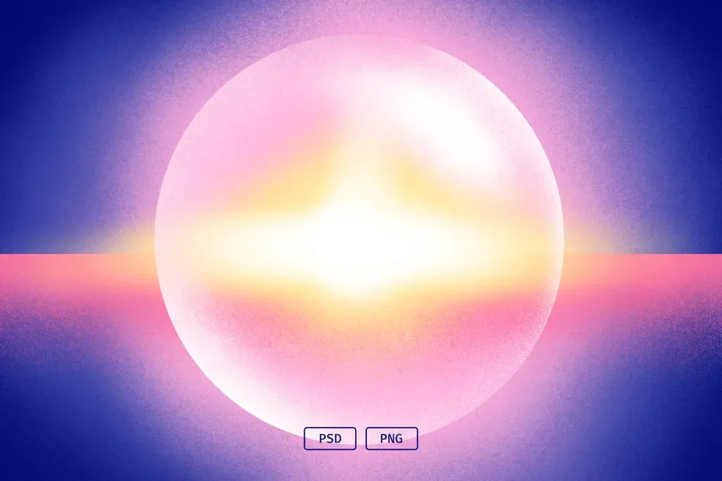
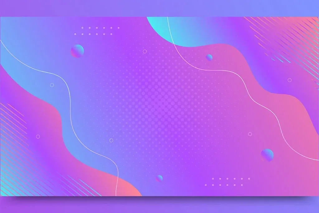
A gradient can be linear, radial, angular or built from several transitions, and it can do more than blend two colors. A brighter center can create a natural focal point for a product. A diagonal gradient can add movement. A subtle transition between brand colors can create depth without adding extra illustration. Adobe describes gradients as useful across graphic design, websites and other visual media because they can add interest while helping foreground content stand out when used carefully.
Keep the palette controlled. Highly saturated gradients can compete with photography and strong typography. If a brand already has defined colors, start from those values and create variations rather than introducing a completely unrelated palette. Light and dark versions are useful when the same campaign needs different logo or text treatments.
Watch for banding and compression in smooth gradients
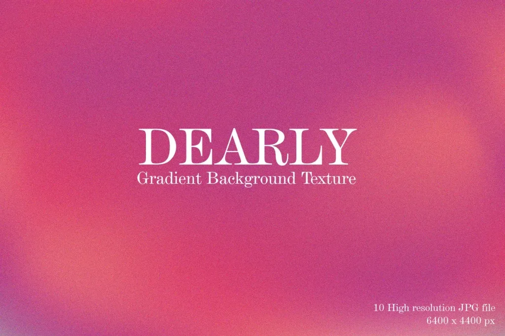
Very smooth gradients can reveal visible color steps after export or platform compression. This banding is especially noticeable when the background contains large areas with only a small tonal change. A controlled amount of noise or texture can sometimes break up the steps, but too much grain defeats the clean appearance that made the gradient useful in the first place.
Do not judge the file only inside the design application. Export a short test in the actual web or social format and view it on a phone. Compression can make a gradient behave differently from the source document, so delivery conditions should be part of the quality check.
Abstract backgrounds need to match the subject, not just the current trend
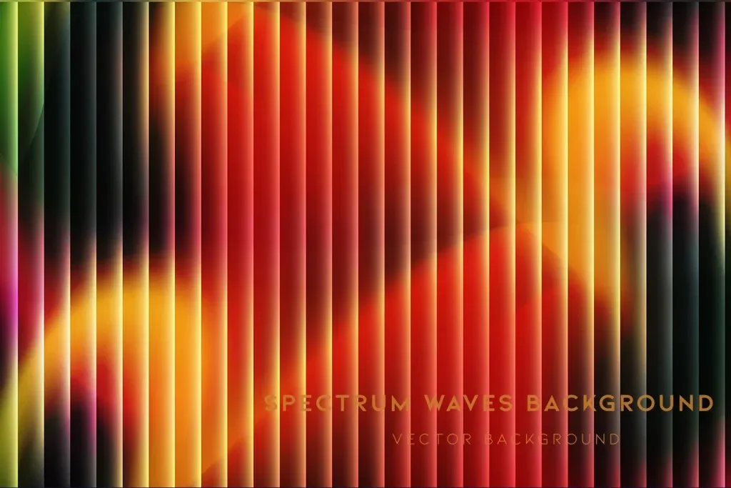
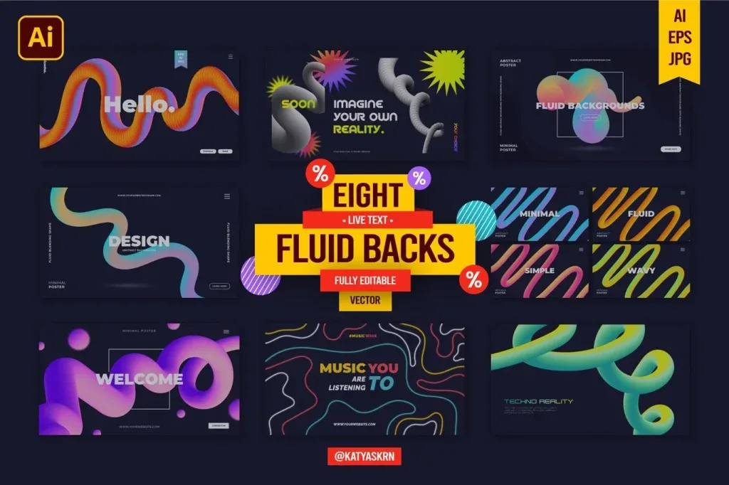
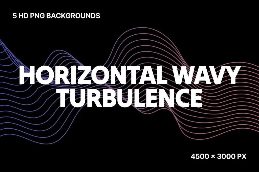
Abstract design can use waves, blurred shapes, line systems, light, 3D forms, glass effects or geometric structures. That flexibility makes abstract backgrounds useful across many industries, but it also makes random selection easy. A technology-oriented fractal may be a poor fit for a wellness brochure, while soft organic forms may not support a cybersecurity campaign.
Look at the movement implied by the forms. Diagonal shapes can feel energetic, soft curves can feel calmer, and structured geometry can support corporate or technical themes. Style should follow the message and audience rather than the fact that an effect is fashionable.
Fractal, galaxy and technology backgrounds work best when the theme supports them
Galaxy, digital network and fractal backgrounds create a strong identity. They can work naturally for science, technology, gaming, music or future-facing communication. Used in an unrelated context, they can make the design feel decorative rather than purposeful. A strong theme is helpful only when it reinforces the subject.
These backgrounds often contain points of light, stars or dense lines. Test text placement carefully and consider how the focal area behaves in vertical crops. A dramatic galaxy centered in a horizontal file may lose its strongest area when converted to a story format.
Thematic backgrounds should communicate context before the copy is read
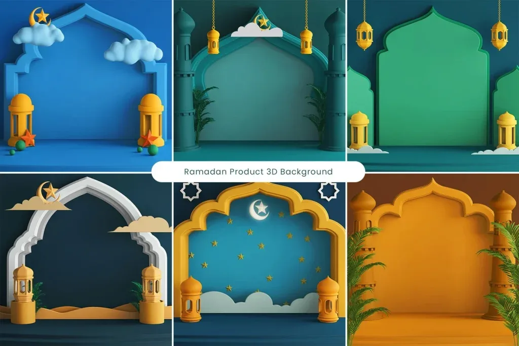
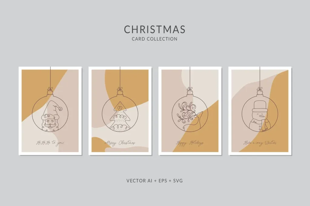
A silhouette, seasonal scene or wellness-oriented cover can identify the subject immediately. That can reduce the number of additional decorative elements required in the layout. At the same time, the thematic element needs to leave enough room for the message and branding.
A large silhouette may be excellent for a poster but difficult to adapt to a social story with several lines of copy. Evaluate the visual subject together with the intended format. The most specific background is not always the most flexible one.
Background and texture are related but not identical roles
Some assets sit close to the boundary, particularly grainy gradients and abstract surfaces. A background generally establishes the complete visual field behind the composition. A texture is more often used to add material quality, grain or surface detail to another color or image. If the main need is surface character rather than a finished backdrop, browse Graphic Textures.
This distinction affects editing. A texture may be blended over several different base colors, while a background often arrives with a more defined color and composition. Decide whether you need a complete field or a layer of surface detail.
Patterns are designed for repetition, while many backgrounds have a fixed focal point
A pattern is usually built from a repeatable unit. A background can be a one-off composition with a specific center, light source or subject. Some background products may be tileable, but that feature should be confirmed per product rather than assumed for the category.
If the project requires seamless coverage across packaging, fabric or a large surface, the Patterns category may be the better starting point. For a poster or cover with a fixed composition, a non-repeating background can provide more intentional control.
Match image dimensions and resolution to the final output
Raster backgrounds depend on pixel dimensions. A file that is too small can lose detail when enlarged for print or a large display. An unnecessarily huge file can make a small web project heavier than it needs to be. Check the actual product information for dimensions and format rather than relying on the category name.
For print, know the final physical size early. For digital work, define the target resolution and aspect ratio. When several outputs are required, keep a high-quality master and create lighter versions for web delivery instead of repeatedly resizing the same working file.
Check editability and file format product by product
Some backgrounds may be delivered as finished image files, while others may include editable structures. The archive itself does not guarantee layers, software compatibility or a specific format. Read the individual product details before deciding whether a file fits your workflow.
If color, shape and lighting must change substantially, an editable source can be more valuable. If the design only needs a ready-to-place background, a high-quality finished image may be entirely sufficient. Choose according to the work that remains after download.
Test horizontal, vertical and square crops before committing
A focal point that works in a 16:9 composition can disappear in a 9:16 crop. Before extensive customization, test the background in the main delivery ratios. If text is involved, make sure each version still provides a usable quiet area.
Backgrounds with balanced negative space often adapt more easily to multi-platform campaigns. A file with a fixed subject near one edge may need extending or reconstruction for other formats. That additional work should be considered during selection.
Measure text contrast on the actual area where the text will sit
White type may be perfectly readable over one side of a gradient and nearly disappear over another. Place the real headline in its final position and evaluate contrast there. Shadows, strokes and overlays can help, but choosing a more suitable background is usually cleaner than fixing a fundamentally poor text area afterward.
Layouts with long copy benefit from calmer backgrounds. A short cover title can tolerate more visual activity because there are fewer words competing for attention. The amount of content should be part of the background decision.
Coordinate background color with brand and foreground photography
If a product or logo uses a distinctive color, the background should not cause it to disappear into a similar tone. Neutral or contrasting backgrounds can make branded color more visible. Use the project palette as a reference when selecting or recoloring gradient and abstract files.
For multi-post campaigns, create a family rather than a collection of unrelated backgrounds. They do not need to be identical, but shared color logic, texture level and visual energy can make the entire set feel intentional.
Create light and dark variants when the background will be reused
A reusable background often needs to support different logos, text colors and contexts. A light and dark version can reduce last-minute adjustments and make the asset more flexible across a campaign. Test each variant with the real logo, buttons and headline rather than assuming the same contrast rules work everywhere.
Save those variants with clear names and keep the master source unchanged. This is especially useful for teams that need to produce new posts or covers repeatedly without rebuilding the background treatment each time.
Print proofs can reveal gradient and texture issues that screens hide
Screens emit light while print reflects it, so subtle shadows, gradients and texture can reproduce differently. If the background is important to a brochure, package or poster, a small proof can reveal whether the tonal transitions and detail still work on paper.
Remember bleed and trimming as well. The background should extend far enough beyond the cut line, while important thematic elements should remain safely inside the final area. Downloaded artwork still needs to be adapted to the printer’s specification.
File size and working performance are part of practical quality
Very large layered backgrounds can make Photoshop or layout documents unnecessarily heavy, especially across many pages. Keep a high-quality master, but prepare appropriately sized working versions when the final destination is small. That can improve save, preview and export speed without sacrificing visible quality.
Organize backgrounds by style, palette and use. When a library contains dozens of gradients and abstract designs, searchable names and visual previews reduce the time spent looking for the same type of file in future projects.
Review usage terms before using a background commercially
A downloadable background is not automatically licensed for redistribution as a source file or for every kind of merchandise. Usage conditions vary by product and provider. Check the relevant license when the asset is used in client work, packaging, templates or products intended for resale.
Keeping source and license information with the project makes later revisions easier. If a campaign is extended months later, the team can quickly confirm where the background came from and how it may be used.
Use a practical checklist before choosing graphic backgrounds
Compare subject, negative space, palette, contrast, aspect ratio, resolution, format, editability and file size. Test the real headline, logo or product over the image before final selection. A background should become more useful when content is added, not less readable.
Return to the broader Graphic Design Assets category when a texture, pattern, icon or other resource would solve the task more directly. Graphic backgrounds are strongest when they establish mood and structure while leaving the foreground message easy to see across the required outputs.