Photoshop mockup PSD files turn flat artwork into presentation-ready scenes
A Photoshop mockup PSD is useful when the design is finished enough to evaluate in context but the real product, print sample or device presentation is not available yet. Instead of showing a logo, label, interface or poster as a flat rectangle, a mockup places that artwork into a scene with perspective, lighting, material and depth. That makes it easier to judge scale, hierarchy and visual balance before a client presentation, portfolio upload, campaign launch or print decision.
The strongest mockup is not automatically the scene with the most props or dramatic shadows. It is the one that resembles the intended use closely enough to reveal whether the design actually works. A label for a flexible pouch should be tested on a shape with similar folds and printable area. A mobile interface should be reviewed inside a device scene that leaves the important screen content visible. A stationery identity needs enough surface area to compare logo size, typography and spacing across several touchpoints.
Choose the scene by the design problem you need to solve
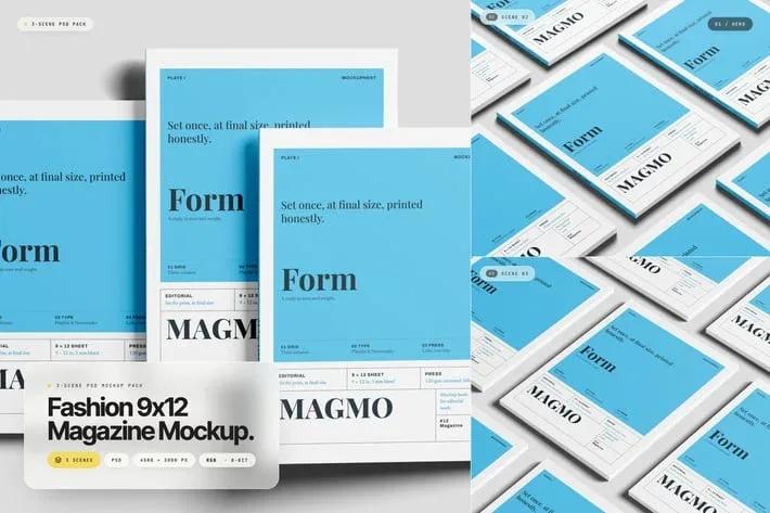
Mockups serve different purposes. Packaging mockups help you see how artwork wraps around boxes, bottles, pouches, cups or containers. Branding scenes combine items such as cards, stationery, folders or packaging so a visual identity can be reviewed as a system. Device mockups are suited to websites and apps. Print mockups can help present posters, magazines, brochures, signage or business cards. A good choice starts with the real application, not with a decorative style.
Before downloading, write down what must be visible in the final image. If the goal is to present front-panel packaging, a top-down scene that hides the front may not help. If the goal is a portfolio hero image, a more cinematic composition can be useful. If the goal is design review, a neutral angle with fewer distractions can expose spacing, typography and alignment more clearly.
Smart Objects are valuable because they preserve an editable workflow
Adobe documents Smart Objects as a non-destructive way to keep source content intact while it is transformed inside a Photoshop document. In practical mockup work, that means artwork can often be inserted into a prepared Smart Object and updated while the perspective, scale or other transformations already built into the scene remain in place. This is one reason PSD mockups are efficient for repeated presentation work.
Do not assume every PSD uses the same structure, however. Some files separate front, side and top artwork. Others use several Smart Objects for labels, cards or screens. Some scenes provide background, shadow and object-color controls; others are more fixed. Open the Layers panel first and understand what is editable before replacing anything. The product page and included instructions should be treated as the source of truth for the specific file.
Replace artwork without flattening the original source
When a mockup provides an editable Smart Object, work from a clean copy of the PSD. Open or replace the Smart Object contents, place the real artwork, save the embedded document and return to the main scene. Adobe notes that saved Smart Object changes update the instance in the Photoshop document while preserving the transformations that were already applied.
Use the best source artwork available. A low-resolution logo or screenshot does not become sharper because it sits inside a polished PSD. Keep vector logos, high-resolution labels and original interface exports when possible. Repeatedly scaling a weak raster file up and down can make the presentation look soft even if the mockup itself is high resolution.
Perspective should make the design believable without hiding important information
Perspective is part of the value of a mockup, but it can also make a design harder to judge. Text near the far edge of a box may become compressed. A logo placed mathematically in the center of flat artwork can look visually off-center on an angled surface. Curved containers can distort lines and typography near the sides. After placing the design, inspect how the important elements read in the final perspective rather than assuming the flat layout will translate perfectly.
If the scene is for approval rather than advertising, choose an angle that still lets the client evaluate the design. Very extreme perspective may create a dramatic image while hiding ingredients, small text or supporting information. In many cases it is better to create several mockup views—one hero image for impact and one clearer view for practical review.
Lighting, shadows and reflections should support the design
Realistic lighting helps an object sit naturally in a scene, but too much reflection can cover exactly the information the mockup is meant to show. Glossy device screens, bottles and coated packaging need particular attention. If the PSD includes adjustable highlights, reflections or shadow layers, tune them for legibility rather than simply maximizing realism.
Material matters too. Paper and matte cardboard usually call for softer reflections, while glass, plastic or polished metal may need stronger specular highlights. The goal is to make the scene believable while keeping the logo, label, interface or typography easy to understand.
Use packaging mockups to check more than the front panel
Packaging design often continues around edges, side panels, closures and secondary surfaces. A useful box or pouch mockup can reveal whether a pattern aligns, whether a logo remains clear on a narrow side and whether front and back information feel part of one system. When a PSD exposes several editable faces, test all of them instead of focusing only on the hero panel.
For product families, place several variants together when possible. Compare flavor colors, model names, size labels and secondary information. The variants should be easy to distinguish without losing the shared brand language. A mockup is particularly useful here because it shows whether a packaging system still feels coherent when several units are viewed side by side.
Branding mockups should behave like one visual identity
A branding scene may contain cards, stationery, packaging, folders, tags or other objects. Replace every visible sample element with the same current identity system. Mixing different logo versions, color values or typography rules inside one mockup can make the brand look inconsistent even when the individual artwork files are correct.
Use the scene to test hierarchy. The primary mark does not need to be equally large on every item. A small card, a folder and a box have different viewing distances and available space. Consistency comes from shared rules, not identical scale. Mockups are useful because they let you compare those rules in one frame before physical production.
Device mockups should preserve screen readability
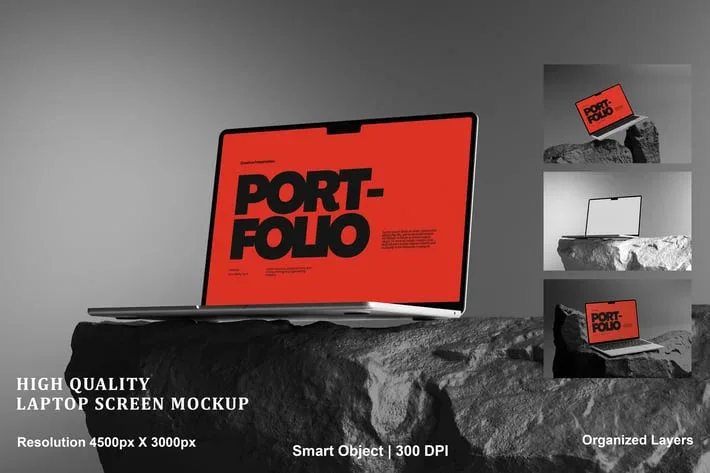
Phone, tablet and laptop scenes are useful for presenting websites, apps and dashboards, but the device frame should not become more important than the interface. Check how much of the screen remains visible, whether reflections reduce contrast and whether the viewing angle makes small interface text unreadable. A dramatic perspective can be attractive for a campaign image, while a straighter view is often better when the purpose is to explain a UI or compare screens.
Use screenshots at an appropriate resolution and keep the original aspect ratio. If the screen area is vertical, do not force a wide interface into it without planning the crop. For a multi-device scene, decide whether each device shows a different state of the product or whether the same screen is being repeated only for decoration. A stronger presentation usually tells a clear product story across the devices.
Mockups for print should respect the limits of the real format
A brochure, card, poster or magazine mockup can show how a printed piece feels in context, but it should not be used to hide production issues. Bleed, fold lines, safe margins, spine width and real trim size still need to be prepared in the original artwork. The mockup is a presentation layer, not a substitute for print-ready setup.
If a scene bends or folds paper, inspect important text near the deformation. A headline that looks fine on a flat layout may become difficult to read when it crosses a fold or disappears into a curved page. For approval work, it can be useful to show both the realistic mockup and the flat print layout so the presentation remains attractive without losing technical clarity.
Background choice changes how the mockup is perceived
A neutral background can make the product or identity easier to evaluate, while a textured or colorful scene can create a stronger advertising mood. If the PSD lets you change the background, compare a few options instead of accepting the default. The surrounding color should not merge with the object edges or shift attention away from the artwork.
When you need supporting design material rather than a complete scene, the Graphic Design Assets archive can provide reusable visual elements, while Graphic Backgrounds can be useful when a separate backdrop is more appropriate than the one included in the PSD. Keep the final composition simple enough that the mockup still communicates the design itself.
Keep brand colors accurate through the presentation workflow
Mockup lighting can make colors appear lighter, darker or more saturated than the flat artwork. That can be realistic, but it should not create a misleading impression of the actual brand. Compare the mockup against the original palette and check whether the scene treatment pushes an important color too far. If exact color judgment matters, do not use the mockup as the only approval view.
This is especially important for packaging families, corporate identity work and products whose color is part of recognition. A warm studio scene may make a neutral gray look beige; a strong blue environment can make skin, white materials or brand colors feel colder. Use the mockup for context while keeping a clean reference nearby.
Build several views from one mockup only when each view adds information
Many presentations become weaker because they repeat the same design across too many nearly identical angles. Use multiple scenes when they reveal a new surface, show scale, clarify material or support the story. A front view can establish the design, a side view can show secondary information and a close-up can highlight texture or print detail.
For portfolio work, think in sequences rather than isolated images. Start with a clear hero image, follow with supporting views and end with details or the wider identity system. A mockup set should make the project easier to understand, not simply make the portfolio longer.
Check file size and performance before committing to a heavy PSD
High-resolution mockups with many Smart Objects, effects and embedded images can be demanding. Large files are useful when the final presentation needs close detail, but they can slow saving and editing on limited hardware. Keep the original PSD intact and create a working strategy that suits the output instead of flattening layers too early.
If a scene becomes sluggish, avoid unnecessary duplicate Smart Objects and oversized source images. Work with a copy and preserve the master. For final export, create the required web or presentation size rather than sending the entire working document when only a flattened image is needed.
Organize mockup files so they remain useful after the first project
Mockups become more valuable when they are easy to find again. Organize by use—packaging, devices, stationery, signage, apparel or social presentation—and keep preview images with the source files. Rename generic download folders with meaningful subjects while preserving the original license or source information.
For team work, store the untouched PSD separately from client-specific versions. This prevents accidental overwriting and makes it easier to reuse the same scene for another brand. If a mockup depends on linked content, fonts or external assets, document those requirements so another designer can reopen the project without guessing.
Review licensing before using a mockup in commercial presentation
A PSD mockup can be used to present artwork, but usage rights vary by source and product. Do not assume that downloading a file permits redistribution of the PSD, resale as a template or every merchandise use. Review the license attached to the specific product, especially when the final presentation is part of a client campaign, paid advertisement or product listing.
Keep source and license information beside the project files. That record is useful when a campaign is revised later, when another team member needs to recreate the scene or when the same mockup is proposed for a different commercial use.
Use a practical checklist before choosing a Photoshop mockup PSD
Confirm that the object type matches the real design, the angle shows the important area, the file supports the edits you need and the final resolution suits the intended output. Review Smart Objects, masks, shadows, reflections and background controls instead of assuming every PSD is built the same way. Place real artwork early and inspect the result at both full resolution and final display size.
Photoshop mockup PSD templates are most useful when they make a design easier to evaluate, explain and present. The right file should reduce repetitive production work while keeping enough control over artwork, color and context. Choose the scene for the design problem first, then use the mockup to build a believable presentation around the work—not to hide weaknesses in the work itself.