After Effects Broadcast, News, and Virtual Studio Templates
Broadcast, news, and virtual studio templates are designed for efficient, polished production and are useful for digital networks, local stations, news organizations, communications teams, producers, and live studios. They complete much of the initial layout, motion, and timing work, allowing the editor to focus on media, identity, and storytelling. A template is still only a starting point. The result becomes distinctive when copy, color, imagery, sound, and duration are adapted to the real project. Before downloading, review the preview, specifications, licensing terms, and editing method rather than judging the asset only by its demonstration.
What are broadcast, news, and virtual studio templates?
Broadcast, news, and virtual studio templates are organized combinations of compositions, layers, and controls created for a defined purpose. A well-built project separates media, text, color, audio, and final output. Its role is to reduce design setup and motion testing, not to produce identical work for every user. Once the folders, precompositions, and controllers are understood, the structure can be adapted. Clear naming, useful documentation, and an obvious output composition add more practical value than a large collection of confusing effects.
Important use cases
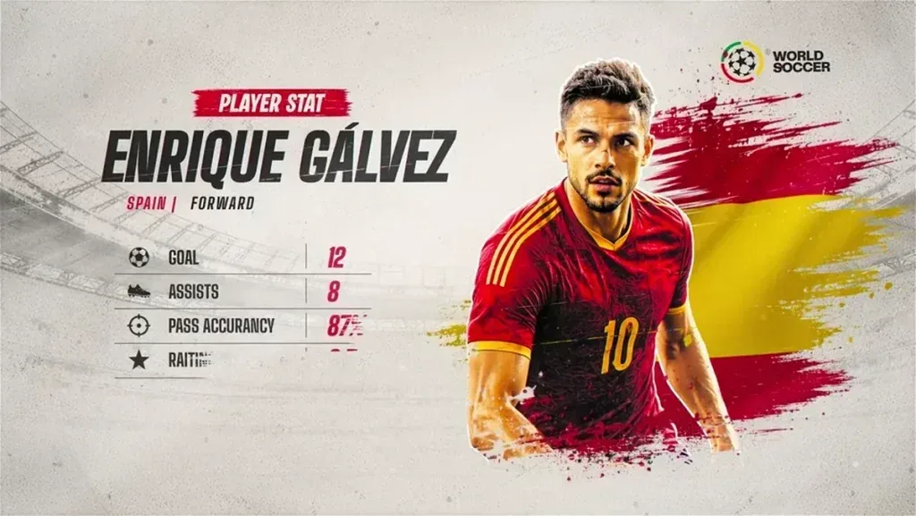
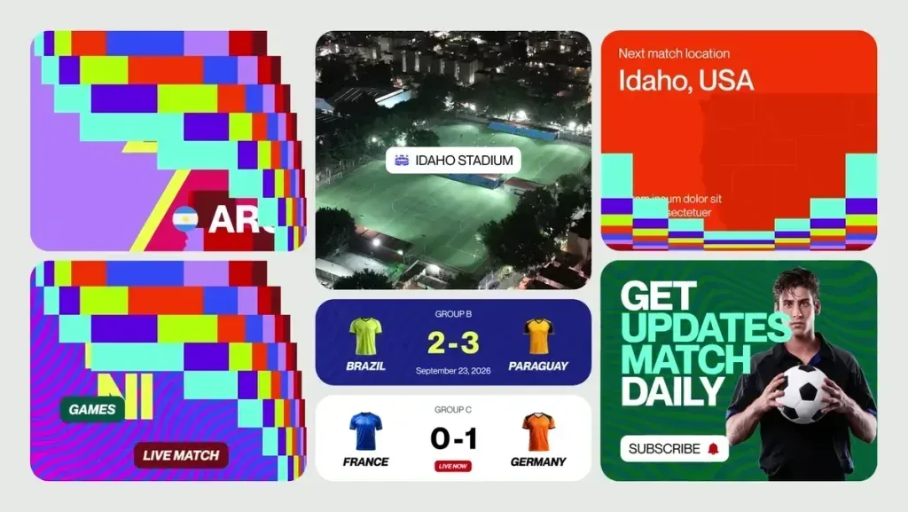
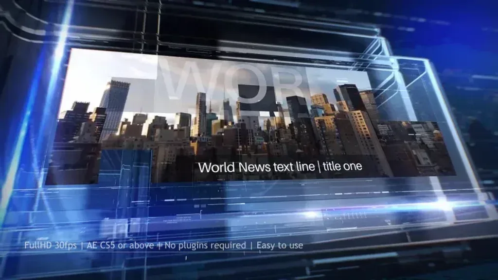
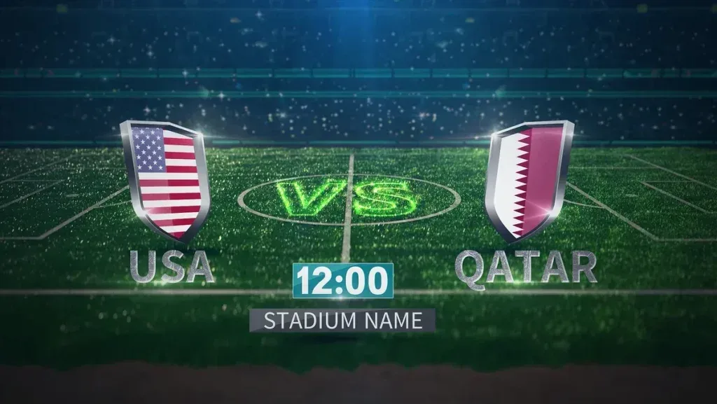
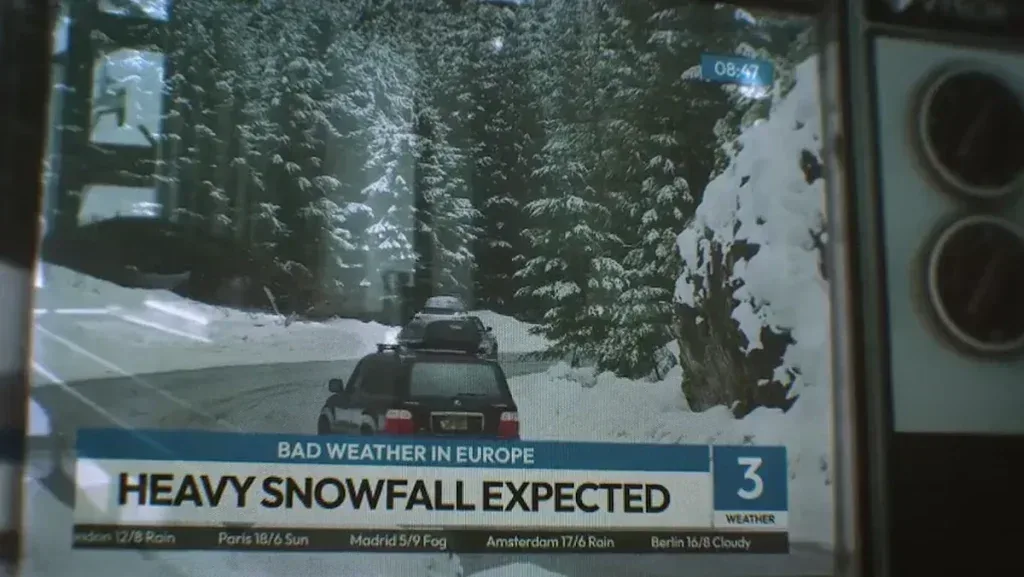
Common uses include news openers, lower thirds, tickers, headlines, maps, statistics, weather, sports, and three-dimensional studios. Decide whether the video is intended to introduce, sell, inform, document memories, or increase engagement, because that decision changes pace, duration, typography, scene count, and the ending. A strong preview can still be unsuitable for the available sources. Compare the real media count, orientation, copy length, and motion style with the placeholders. A template already close to the target usually creates a more natural result and requires less time than an impressive but mismatched project.
Visual styles
This category appears in formal, modern, technology-led, financial, sports, global, urgent, and photorealistic 3D styles. Style should begin with the audience and message, not only the most dramatic effect. Formal communication benefits from controlled movement, contrast, and restrained type, while entertainment can support faster pacing and stronger color. Before editing, define three qualities for the identity, such as clean, warm, and personal or technical, precise, and energetic. These words become a practical filter for removing unnecessary effects and keeping every scene aligned with one visual direction.
Typical project components
Many files include logo reveals, clocks, crawlers, lower thirds, video frames, maps, charts, screens, anchor desks, and camera moves. More components do not automatically create a better template; clarity, control, and independent usability matter more. Locate the media, text, color, audio, and output folders, then save a backup. Edit one test composition to understand the system. When a central controller is provided, use it for color, scale, and effect intensity instead of changing many unrelated layers. Centralized controls reduce inconsistency and make future revisions much easier.
A practical editing workflow
An efficient workflow includes defining channel identity, replacing logos and titles, timing assets, and preparing transparent outputs for playout. Collect assets in one dedicated folder with short, descriptive names. Build a low-quality draft to test scene order, timing, and message before polishing small details. After the structure is approved, refine typography, color, masks, animation, and sound. This prevents time being spent on a scene that may be removed. For client work, early approval of the structure also reduces late changes and separates content decisions from visual refinement.
Replacing media
Suitable sources include logos, report footage, live video, guest portraits, maps, charts, data, and studio-screen content. Use the labeled placeholder compositions and keep source aspect ratios close to the target frames to avoid excessive cropping. After replacement, inspect position and scale individually because automatic fitting may hide an important face, product, or line of text. Resize oversized still images before import and use an appropriate transparent format when required. Consistent filenames and organized source folders make global updates faster and reduce missing-media problems.
Typography and brand alignment
Color, typography, motion style, and the ending should reflect the project identity. Keep titles concise; replacing a short heading with a sentence can force the type to become too small and disturb the layout. For multilingual work, verify direction, character shaping, numbers, punctuation, and line breaks in the final preview. Use a limited number of type families and weights. For brand work, record the palette and typography rules before editing so all scenes remain consistent.
Aspect ratios and delivery versions
Multi-platform delivery often requires landscape, vertical, and square versions. Changing composition dimensions alone is not enough. Reposition copy, media frames, safe areas, and camera movement for each layout. Keep the main subject and message inside the central safe zone in vertical video, and do not shrink type excessively in square versions. Approve the primary master first, then create derived compositions that share controls and source media to keep copy and color synchronized.
Music, sound, and timing
Music and sound effects should reinforce motion and storytelling without making every small change loud. Leave room for narration or dialogue and lower music under important speech. Many viewers watch social content muted, so captions and visuals must still communicate the message. Review the mix on headphones and ordinary speakers. Small adjustments around beats, pauses, and transitions can make a template feel intentional rather than mechanically filled.
Technical compatibility
Check resolution, frame rate, title-safe areas, alpha support, 3D plugins, software version, and camera angles. Older software may not open the project correctly, and missing plugins can make the result differ from the preview. Confirm whether fonts are included or simply listed. Templates vary from simple controls to complex nested systems, so consider skill level and deadline. Clear instructions, consistent naming, and centralized controls often provide more real value than numerous effects that are difficult to understand or remove.
Performance and heavy projects
Use lower preview quality, proxies, cache management, and fast storage to keep editing responsive. Motion blur, depth of field, shadows, and high sample counts can be reduced while working, then restored before final rendering. Pre-render stable sections in demanding files and replace them with video. Organized media and removal of unused sources reduce loading time, memory use, and avoidable errors.
Selecting the right template
Write separate lists for essential requirements and optional features. Watch the preview without relying on promotional music so typography, spacing, motion, and truly useful scene count can be judged. Review user feedback, update history, documentation, and the license. A project close to the intended result with sufficient control over text, color, and media is usually safer than a complex file that requires extensive rebuilding.
Free downloads and licensing
Free does not automatically permit every use. An asset may be free for personal work but require another license for advertising, broadcast, monetized content, or client projects. Preview music, fonts, photographs, and footage may be excluded or licensed separately. Read the source terms, retain proof of download, and register subscription assets to the correct end project. These steps reduce takedowns, ownership claims, and licensing disputes.
File organization and handoff
Keep the original project, used media, permitted fonts, licensed audio, exports, and a backup together. Use project collection tools when transferring files so linked paths do not break. Name the output, version, date, and aspect ratio clearly. Provide clients with previews and final deliverables, and include editable files only when agreed. Removing tests and unused assets reduces package size and makes later updates easier.
Common mistakes
Common mistakes include visual clutter, undersized type, fast tickers, weak contrast, unsafe text, and distracting camera movement. Other problems come from editing the only copy, renaming dependent layers without understanding the structure, and keeping every effect even when it conflicts with the subject. Intelligent removal often improves the result. Test an export on a phone and an ordinary display to evaluate type size, brightness, color, and real pacing instead of relying only on the editing interface.
Final export settings
Confirm the work area, resolution, frame rate, audio, alpha settings, and destination before rendering. Use a high-quality intermediate codec when the file will continue into another edit and a standard compressed format for direct publishing. Test a short section containing small type, rapid movement, gradients, or particles to identify compression issues. Create a version for each platform and include the subject, version, aspect ratio, and date in filenames.
Customizing beyond the preview
The preview is not a rulebook. Remove scenes that do not support the message, reorder sections, reduce effects, or create new space for copy and media. Make structural decisions first, including duration and scene order, before polishing small details. For major changes, work on a separate version so the original system remains available for reference. A restrained adaptation often feels more professional than a project that preserves every decorative element simply because it was included.
Multilingual and localized versions
A language change affects more than words. Different scripts and sentence lengths can alter line breaks, alignment, spacing, and the visual center of a scene. Review every localized composition rather than applying one global replacement. Use typefaces with complete language support and verify punctuation, numerals, and direction. Keep the same hierarchy and brand system across languages while allowing enough flexibility for each version to remain readable and natural.
Building reusable variants
Once customized, the project can become a repeatable production system. Keep a clean master with approved colors, fonts, logos, and recurring elements, then duplicate it for each campaign, episode, or client variation. Use clear composition and version names and keep a brief change log. This approach speeds future work and prevents accidental changes to the approved master while preserving consistency across a series of related outputs.
Quality control before delivery
Watch the complete video without stopping, then inspect sensitive sections frame by frame. Check spelling, missing media, unwanted edges, flicker, animation collisions, and audio synchronization. Pay special attention to the first and final frames, where timing and transparency errors are common. Ask another person to review the export when possible; a fresh viewer often notices issues that become invisible after long editing sessions.
Client and team collaboration
Agree on duration, formats, revision rounds, and deliverables before editing. Send lightweight review files with timecode or clearly numbered scenes so feedback is precise. Consolidate notes into organized rounds and make changes on a new version. In team workflows, maintain a fixed folder structure and avoid moving sources casually. Clear approval stages and organized handoffs reduce duplicated effort and protect the project from broken links or conflicting edits.
Preserving message clarity
A sophisticated effect cannot rescue an unclear message. Viewers should quickly understand the subject and the intended action. Place the most important information where it is easiest to see and use hierarchy to guide attention from headline to image to call to action. Background motion should support rather than compete with the content. When a scene feels crowded, remove the least important element and evaluate it again before adding anything new.
Archiving for future updates
After approval, keep an editable source, a collected project package, and a high-quality master render. Record the software version, plugins, fonts, and key settings used. Saving a small brand reference with colors and control values makes future updates faster. Organized archiving is especially valuable when a date, price, logo, or language version must be changed months later without rebuilding the entire production.
Conclusion
Broadcast, news, and virtual studio templates work best as customizable professional foundations rather than finished products that need no changes. Choosing the right file, organizing sources, refining copy and color, controlling pace, and checking licenses produces work that is attractive and practical. One well-prepared project can generate coordinated versions for several platforms and reduce production time. Clear communication and consistent identity remain the goal; effects and motion matter only when they support it.